| Budget DTP | |
| on RISC OS |
7 : The Font System
Outline Fonts and Bitmap Fonts.
The original fonts supplied with early ARM based Acorn computers computers were bitmap fonts. This means that the shapes of the characters were stored as numbers which represented the colours of the individual dots that made up each character's image. Bitmaps were provided for several different sizes of font. Sizes not included were obtained by enlarging or reducing the nearest available size. Not surprisingly, for very large font sizes this gave a hideously crude appearance. However, with the almost universal use of the Acorn outline font manager text should always appear smooth, even in very large point sizes, unless you have deliberately chosen to ue a bitmap font.
Fonts are required for two quite distinct processes. They appear on the monitor screen in an accurate representation of the page being designed and they are sent as graphics to the printer when the page is printed. The two requirements are quite different. The screen has far coarser resolution than most printers-even a Mode 20 multisync screen has only 640 pixels (dots) from edge to edge, whereas an Epson FX-80 or compatible dot-matrix printer can print a nominal 1920 dots across a page of A4. The screen, however, has one advantage over the printer-it can display intermediate shades. The printer can only put dots of one colour, most often black, on the paper, which is usually white.
Anti-aliasing
The ability of the screen to display intermediate shades led to one of the most advanced features of RISC OS computers,the use of "anti-aliased" character displays.
When displaying a complex shape using a fairly coarse medium such as the matrix of pixels on a monitor screen, it is inevitable that there will be inaccuracies. Consider, for instance, the problems involved in displaying a large black letter "A" against a white background. Some pixels will be wholly in areas covered by the black strokes of the character. Clearly these pixels will be "off" so they appear black. Some pixels will be wholly in areas not touched by the strokes of the character; for instance, in the hollows in the centre of the character. Clearly these will be "on" and therefore white. But many pixels will be in areas partially covered by the strokes of the character, especially as the two main strokes of this character are at angles. If the monitor display were confined to black and white, clearly pixels along the edges of these angled strokes would introduce irregularities into the shape of the character as seen on the screen. The angled lines would not appear straight, but would rise in steps as shown below. This is known as "aliasing".
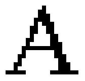
There is, however, a solution to this problem. That is to show the partially obscured pixels in intermediate shades of grey. A pixel representing an area that is largely covered by a stroke displays a dark shade, while a pixel that is only slightly obscured displays a lighter shade. The edges of the letter "A" now appear to be straight. In fact this is an illusion; magnify the screen display, as in Figure 7.2, and you will see that the edges of the "A" are still far from straight, but the grey shades form a visual buffer between the black and white areas of the screen making the aliasing far less obvious. This process is called anti-aliasing and it gives the appearance of resolution well in excess of the monitor's capability.
Unfortunately, anti-aliasing is no help to the printer since the printer cannot handle intermediate shades. This is why printouts from applications using bitmapped fonts always appear somewhat crude.
Outline Fonts
The introduction of the Acorn outline font system, however, led to dramatic improvements in both screen and printout quality. Outline fonts are created using a font editor application, !FontEd, in which the outline of each character is drawn using routines similar to the path object drawing routines in !Draw. The computer records the plotting instructions for each character and stores them in a file called Outlines. Another file called IntMetrics stores data concerning each character's width and height.
The principal advantage of this system is that it is totally independent of font size. Any size of font can be specified and the computer will simply multiply the plot distances by the requested font size resulting in perfectly formed characters of that size, both on screen and on paper. It is even possible to specify different font sizes for height and width so that condensed (narrower than natural) or expanded (wider than natural) characters are produced.
When putting characters on the screen, the font manager software first plots the character on a "virtual" screen to produce a fully anti-aliased bitmap of the character at the requested size. This is then copied to the screen. As characters are used, so their bitmaps are stored in a reserved area of memory called the font cache. Use of a font cache greatly speeds up the rate at which characters can be put on the screen. Without it, the software would need to access the disc repeatedly for plotting instructions and repeat the outline-to-bitmap conversion for each occurrence of a character. Hence writing on the screen would become painfully slow.
When printing on paper the character plotting instructions are converted to another bitmap - this time, of course, without anti- aliasing. However, the resolution used is generally much higher, appropriate to the graphics mode selected on the printer driver. Even low-cost 9-pin dot-matrix printers which support graphics at 240 x 216 dots per inch are capable of giving finely detailed, impressive printouts.
How Outline Fonts are Organised
As mentioned above, each outline font consists of two files, one named Outlines and one named IntMetrics. The organisation of font files uses, to excellent advantage, the hierarchical directory-within-directory structure of the Acorn Advanced Disc Filing System.
Outline fonts are normally stored in the application directory called !Fonts which also contains two modules concerned with font management. Any fonts not included in !Fonts will not be recognised as fonts bv the font manager.
Let us consider the collection of fonts in the Acorn Font Starter package. This includes three 'families' of fonts; Corpus, Homerton and Trinity. Cataloguing !Fonts will reveal that Corpus, Homerton and Trinity are three directories. Let us concentrate on Trinity. Cataloguing Trinity will show that it contains two further directories named Bold and Medium. Catalogue either of these and you will find that the contents consist of two font files which, as we should expect, are named IntMetrics and Outlines. Each also contains a further directory named Italic, itself containing two font files, IntMetrics and Outlines.
Exactly the same pattern applies to Corpus and Homerton, except that the Italic variants are described as "Oblique" and this is reflected in the names of the appropriate directories
Renaming Fonts
You cannot rename fonts by simply changing the names of the directories in which they are stored. Each "Outlines" file and each "IntMetrics" file contains the full path name below !Fonts and a note is made of this whenever the font manager accesses a file. Suppose, for instance, you renamed the Trinity" directory "Times", and then from !Draw you attempted to create a text object in, say. Times Medium. Then for each character the font would be reloaded from disc, a tediously slow process! This is because the font cache registers the name stored internally in the font file and so regards the font it loaded as Trinity Medium, not Times Medium. To rename a font, in addition to renaming the directories, you must change the pathname entry in the Outlines and IntMetrics files. To do this you must load the font into the Font Editor application, make the necessary changes in its "change" option, and then resave the amended files into the appropriate directories.
Handling Large Collections of Fonts
Outline fonts are available from several sources and you may in time find yourself amassing a considerable collection of them. Since a font can only be used if it is located in the !Fonts application directory, you may quickly find yourself facing a problem. A typical Outlines file is 20 to 30 Kilobytes long, its attendant IntMetrics file 2 to 3 Kilobytes long and each directory is 2 Kilobytes long. So a single font "family" with four variations such as Homerton or Trinity takes up about 120 Kilobytes.
In theory you can place about 70 new font directories in !Fonts, allowing 70 font families. Unfortunately, it's not as simple as that. Some applications can crash if you have too many fonts, and overlarge font menus can become extremely awkward and cumbersome in use.
The easiest solution is to use a Font Manager program which enables you to "switch" fonts in and out of use but if you don't want to do this you could store all your fonts in an innocuously named directory such as Fontstore and keep a much smaller number in !Fonts. In !Fonts I keep the fonts I use most frequently, a total of about 30, plus a number of "visiting" fonts copied across for special purposes. This "visiting" population is perpetually changing.
Varieties of Typeface
One of the joys of DTP is that, as you create a document, you are offered a choice of typefaces. You are no longer restricted to the single style, size and weight of your typewriter typeface or even to the broader but still limited choice offered by most dot-matrix printers.
There are many kinds of typeface and you can use any for any purpose, but nevertheless most are more suitable for certain types of job than others. Let us briefly examine the five font families in the current Acorn and Beebug Font Packs as they are representative of three quite contrasting kinds of typeface.
Corpus is a typewriter-style typeface based on a design named Courier. As on an old-fashioned typewriter, it is a fixed-width face, that is, all characters have the same width, irrespective of their designs. In this, Corpus stands in contrast with Homerton and Trinity which are proportionally spaced, ie the widths of the characters vary according to their designs-a "W" being clearly rather wider than an "\"'.
Corpus is best suited to certain specialised tasks. If you are creating a user manual for a piece of software. Corpus would be suitable for representing input to and output from the computer, since most normal computer displays and printouts are similarly fixed-width. Or if you are designing pages for a magazine or newsletter and you wish to reproduce a letter and to emphasise that it is a letter, put it in Corpus while the rest of publication is in Trinity or Homerton. This will make the letter stand out from the surrounding items and its typescript-like appearance will lend it an air of urgency-as though it had arrived late but was so important that you decided to publish it without typesetting it!
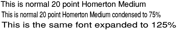
Homerton and SwissB from Beebug are sans-serif typefaces based on a popular design called Helvetica (or Swiss). Sans-serif means that it lacks the serifs or protrusions at the ends of strokes that are so characteristic of typefaces like Trinity and Corpus. A distinctive feature of Helvetica and its derivatives is that all lines are equal in width. Consequently, if you compress Homerton, the vertical strokes get narrower while the horizontal ones remain unchanged and the result does not look right. If you expand Homerton, the vertical strokes get broader, which also does not look right, although the effect is not so disturbing as the condensed effect. This is shown below.
Helvetica-style typefaces are used for a very wide range of purpose including the text of news items and articles in some magazines. They are not ideally suited for this, however, since their legibility is not ai good as some other typefaces. They are better suited to titles, sub titles, introductory paragraphs and advertisement displays.
Trinity is based on Times , named after the newspaper in which it originated. It is a formal serif face offering very high legibility and is therefore ideal for large masses of text in newspapers, magazine articles and books. Its strokes are of varying widths, verticals being generally broader than horizontals. This means that it can be readily expanded or compressed without losing its essential character or sacrificing its legibility.
Paladin in the Beebug font pack is a serif typeface like Trinity, but with a totally different "feel". It is based on a typeface called Palatine influenced as its name suggests by the "chancery cursive" used by scribes in Venice and Rome in the 15th and 16th centuries. Its complex curves give it an air of elegance or even fussiness. It is ideal fo documentation that needs an up-market air such as catalogue; brochures, stylish magazines and some kinds of book.
Vogue in the Beebug font pack is a sans-serif face which offers dramatic contrast from the Helvetica family. Based on a design called Avant-Garde, it is a geometrically proportioned typeface compose mainly from circles and straight lines. It originated in the 1930s and i redolent of the "Art Deco" design fashions of that period. It is nc really suitable for textual work, but is eminently suitable for creating fashionable displays.
Recently Beebug has released some additional fonts. Besides a Courier-equivalent, Bookmark is a formal serif font with a more spacious feel than Trinity. Based on Bookman which was originally intended for use in headings, it is ideally suited to a wide range of text and display work. Chaucer , offered in Medium italic only, is, like Palatine, derived from Chancery Cursive and is inspired by a font called Zapf Chancery. Its antique appearance lends it to specialist design and display work.
The Character Set
The Latin alphabets used in Acorn outline fonts conform to a standard known as ISO 8859/1. This follows the standard ASCII 7-bit character set for codes 32 to 127 but it also uses the further 128 8-bit codes from 128 to 255. This allows the inclusion of many other useful characters and symbols besides sufficient accented characters to cater for most European languages. The complete character set of Trinity Medium is given in Appendix 1.
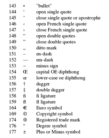
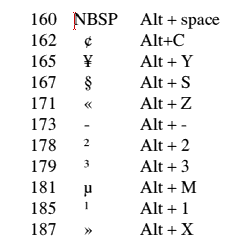
ISO 8859/1 leaves codes 128 to 159 undefined (allowing the user to define his own characters in these codes) but in practice the Acorn and Beebug fonts have introduced some useful additional characters into codes 143 to 159. These are:
Characters 128 to 142 are still undefined and so their codes are available for user-defined characters. To define new characters you will need the Acorn !FontEd application.
Normally the keyboard only allows access to characters having codes in the region 32 to 127. So how can you use characters having codes above 127? There are two ways.
Some, but not all, codes can be accessed direct from the keyboard using special combinations of keys:
Note that in many instances the alternative character is similar to the one obtained by pressing the key without Alt.
The alternative way of obtaining any character is to hold down the Alt key, enter the decimal code of the required character on the numeric keypad and then release the Alt key. For example, to obtain open double quotes in !Draw or !Edit, hold down Alt, enter 148 on the numeric keypad and then release Alt. In !Edit you may find that the wrong character appears on the screen-don't worry, it will be replaced by the right one when the file is transferred to !Draw.
The facility whereby non-keyboard characters can be accessed using combinations of the function keys with Shift or Ctrl or both is unfortunately not available in !Draw or !Edit. Character 160 is described as "NBSP" which stands for "Non-Break Space". It is a space, the same width as the standard space (character 32). It differs from the standard space, however, in that it behaves as a normal character rather than as a delimiter between words. Both !Edit and !Draw will break lines at a standard space, but not at a NBSP, hence its name. So it is useful where you wish two words to remain together on the same line. It is also useful in that its width is constant, whereas that of the standard space can in some circumstances be varied, as, for instance, in justified text. If you require a fixed-width space, eg in paragraph indentations or in columns of figures, use NBSP in preference to the standard space.
In proportionally spaced fonts such as Trinity, the figures all have the same width to facilitate their tidy arrangement in columns and tables. The width of the space and NBSP is equal to half that of a figure, so to substitute spaces for absent figures, allow two spaces per figure.